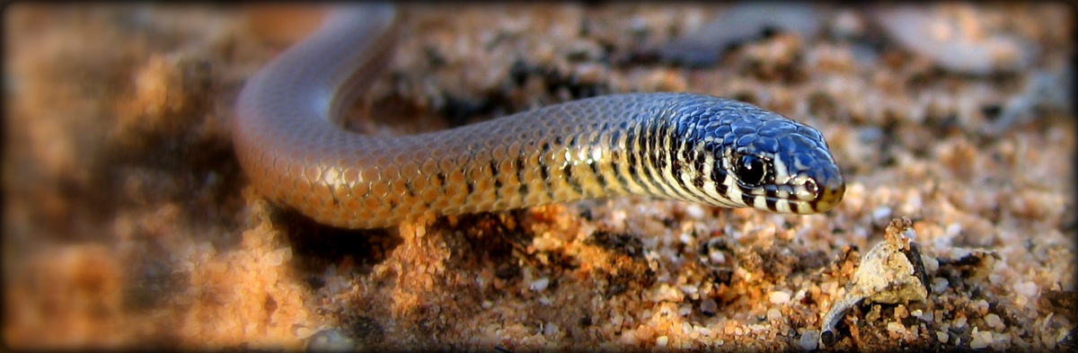
Southern Legless Lizards are stylish critters. Big round eyes, happy smile; who couldn’t love ‘em. What they lack in limbs, Delma make up for in energy, excitability, and a dash of fussiness. Southern legless lizards don’t live just anywhere. They like their mallee habitat to be just right.
Fire shapes the spinifex mallee of south-eastern Australia. Fire, and the time between fires; the period when plants grow, die, drop limbs and decompose. As the mallee grows older, legless lizards – like many animals – become more, or less, common. Some species thrive shortly after a burn, others prosper in old, unburnt stands.
As custodians of mallee fire regimes, we need to know which habitat features Delma and other critters are most sensitive to – and how and when those features change after a fire. How long does it take for trees to hollow, for logs to fall to the ground, for grasses and shrubs to grow up and die down? When does Delma thrive? When might Delma dwindle?
A new mallee ecology

We’ve learned a lot recently about fire ecology in the mallee. A decade ago a team from Deakin and La Trobe Universities began a huge field project, which I introduced in an earlier blog.
They surveyed over 500 sites across 100,000 square kilometers of tree mallee. The sites were last burnt from one to over 160 years ago. Ever enthusiastic, the team caught and counted thousands of reptiles, mammals, plants and birds. They carefully measured habitat features, like tree heights, litter, logs and grasses. Back in the lab they ran the numbers to see when – in the decades after fire scorches the landscape – each species and habitat feature is most and least abundant.
A century in animation
To fast-track a century of slow habitat change, I made a movie of the team’s great results. The animation below shows how seven habitat features rise and fall from 1 to 110 years after a fire. That’s 110 years in 10 short seconds.
The number at the bottom right shows how many years have passed since the last fire. The maximum value each feature achieves during the 110-year period is assigned 100%, at the top of the chart. To make it easier to see when each feature declines, the red lines show the highest level each feature has reached by that stage in the sequence.

Too much, too fast? Let’s scan the changes one at a time, starting with tree height on the left.
After fire, burnt mallee trees re-sprout from the base. The new stems steadily grow taller for the first 60 years old, and more slowly from 60 to 110 years. The oldest stands have the tallest trees.
The second bar shows how much cover the tree canopies provide. Cover increases steadily for about 70 years, but then declines as older stands become more open. Why? The next column, stem density, provides a clue.
Mallee eucalypts sprout a lot of stems (or trunks). The number of stems increases for the first 20 years, but then falls as stems thin out and die. The oldest stands have a quarter of the number of stems, and a much more open canopy, than the 20-year old stands.
Hollows are the tortoises of the forest. It takes a long time for new trunks to grow, decay and form hollows. The ‘hollows (live)’ column shows the proportion of the live trunks that has a hollow. Few hollows exist for the first 35 years. Hollows form more quickly from 35 to 60 years after fire, and (for some reason) more slowly later on. As you’d expect, the oldest stands have the most hollows.

Loose, hanging bark provides food and shelter for many species, especially invertebrates. Bark is boringly predictable: it increases steadily as time progresses.
Not everything increases over time. Spinifex hummocks (Triodia scariosa) provide important habitat for many ground animals. Spinifex peaks early, at about 30 years after fire, and declines in older stands.
Logs on the ground show a strange trajectory. There’s a lot at first, as many fire-killed trunks fall quickly to the ground. Logs accumulate on the ground for the first 15 years and then – from 15 to 50 years – the number drops; presumably because many decompose. Numbers then increase again, as more trunks fall in old stands.
The ever-changing mallee

Like all ecosystems, the mallee is never stable; it changes continually, but ever-so-slowly. Each habitat feature rises and falls at a different rate. Some peak early (e.g. tree density), others rise and fall later (spinifex and logs), some build steadily (bark), and some start slow and pick up towards the end (hollows). Every feature will continue to change if stands grow older; 110 years doesn’t mark the end of the cycle, just the end of the sampling.
The key insight from the team’s work isn’t that habitats change – you knew that would happen. Their work shows when each feature changes, and the shape of each trajectory – the slow rise and fall of a century of plant growth, death and decay.
Their charts are gold. We can now predict, for example, how habitats will change under different fire regimes. Watch the animation again and consider: if a stand was repeatedly burnt every 10 years, or every 30 years, how many live tree trunks would contain a hollow? How would spinifex fare under a 30-year burn cycle?
That fussy legless lizard
Delma australis is abundant in some parts of the Mallee and sparse in others. Why? Many factors influence the abundance of a species. We wouldn’t expect Delma to be tied solely to changes in a single habitat feature. Nevertheless, some animals rely heavily on certain habitat features, so let’s see how that legless lizard rolls.
The animation below shows how habitat features and the abundance of Delma change over time. It’s the same chart as the one above, with Delma instead of logs in the last column, and the cycle runs for 100 instead of 110 years. (The Delma data are from spinifex mallee sites south of the Murray River in Nimmo et al. 2012). Check it out and ask yourself:
- Is Delma an early riser or a late starter?
- When does Delma downsize?
- Which habitat feature is Delma most closely associated with?

To understand how animals change after fire, we need to know how their habitats change. How well can you predict post-fire changes in habitat and fauna in your local patch of bush? I bet you can’t beat the mallee team.
Acknowledgements
Thanks to Dr Angie Haslem, Dr Dale Nimmo and Dr Simon Watson from the La Trobe and Deakin University Mallee Fire and Biodiversity Team for fact-checking this week’s post. The animated charts are also available on YouTube. The YouTube files have some introductory text and can be paused and rewound, unlike the animated gif files on this page. This is the first time I’ve used animated charts in a blog. What do you think? For comparison, the original charts in Angie Haslem’s paper looked like this.
Further reading
Haslem A, Kelly LT, Nimmo DG, Watson SJ, Kenny SA, Taylor RS, Avitabile SC, Callister KE, Spence-Bailey LM, Clarke MF & Bennett AF (2011) Habitat or fuel? Implications of long-term, post-fire dynamics for the development of key resources for fauna and fire. Journal of Applied Ecology 48, 247-256.
Nimmo DG, Kelly LT, Spence-Bailey LM, Watson SJ, Haslem A, White JG, Clarke MF & Bennett AF (2012) Predicting the century-long post-fire responses of reptiles. Global Ecology and Biogeography 21, 1062-1073.

Hi Ian,
Once I became accustom as to how and what the animated charts displayed data I thought that it was a great way to easily and rapidly compare the trends. Thanks for trying something new – I’d enjoy viewing them in any future blog!
I am always amazed when researchers bring a part of the intricate web of ecology into our known world. It gives us a better chance to look after our place. Maybe that’s why the Delma australis is smiling!
Thanks again.
Rus
Thanks very much Rus, I’m glad you liked them. They make the blog a lot more interesting than the basic printed charts would have done, I think (or hope!). Thanks again and best wishes Ian
And here’s some nice feedback from Twitter…
Excellent. Thanks Ian – what a really neat way to show the 100 yrs of change that Ang & team have identified. If you don’t mind me asking, how long did it take you to generate this?? I ask because I wonder why we don’t do this more often? Is it too time consuming for your average scientist, despite the great science communication you achieve?? JOHN
Hi John, it did take a while to do, but that’s because I didn’t quite know what I was aiming for or which tools to use, so there was a fair bit of trial and error. If I had to do it all again it would be very fast. Basically, the picture is just an Excel graph with rectangles drawn on top of it. Each time step was captured as an image file and an animated gif file was created from the sequence of images. I’m sure the ’average’ early career ecologist who can code in R could knock this up in a flash.
I think a bigger reason why we don’t do things like this more often is that we are so accustomed to seeing the outputs we produce for papers as being the ‘best’ forms of communication, whereas the web allows us so to explore so many more possibilities. So I suspect we’re limited by vision and great examples rather than time. My attempt was inspired by Don Driscoll’s great animation on fragmentation – https://www.youtube.com/watch?v=JZwTZ-d1ZRE – although Don used a completely different method. It’ll be great to have more examples to draw upon in the future. Best wishes Ian
This is a great graphical tool. Excellent representation of change and trend. Makes the written message and journal paper even more powerful. I am tempted to explore this style of presentation in my own sites at http://portal.tern.org.au/search#!/q=(Vegetation%20transformation)/p=1/tab=collection/num=10
Thanks Richard, I’m sure you’ll do far more wonderful things than this with your great datasets and resources. I look forward to seeing what you come up with. Best wishes Ian
The animation really brings the timescale and relationships into something tangible for interested amateurs like me. My head is brimming with the possibilities. Thanks Ian for another great post. Sharing on FB.
Thanks Jan, I’m glad you enjoyed it. And thanks once again for sharing my blogs on Facebook. I’m most grateful to you and everyone else who shares the blog posts. Best wishes Ian
Thank you Ian the graphics are a great way to represent change but can you slow them down a bit? Have also forwarded Don Driscoll’s Matrix of Ecology video onto Landcare and some high schools. Yet another useful resource.
Hello Toni, sorry about the speed. I tried a number of different speeds and this was the best compromise I came up with. I’ll see if I can make a slower version and perhaps insert an extra link to it. I’m not sure how quick this will be to do. In the interim, the versions on YouTube can be paused at will. Best wishes Ian
UPDATE: I’ve now added a link in the figure captions to provide an extra, slower version of each animation.
Hi Ian, The animations are much easier (and entertaining) to interpret than the original graphs, but I also greatly appreciate your explanations underneath. As for predicting post-fire changes in my local habitat… given that’s been inner suburban Melbourne for the last couple of years, I certainly hope I don’t witness any!
Hi Dayna, thanks very much, I’m glad you enjoyed them. Best wishes Ian
Excellent post, Ian!